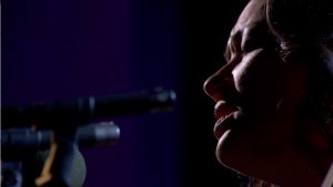
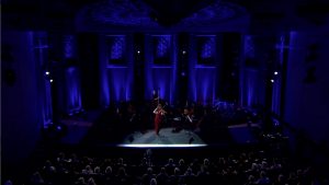
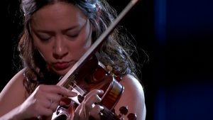
Jeff Ravitz and Intensity Advisors, created the lighting for a unique and exciting evening of music by violin virtuoso Lucia Micarelli. The show premieres on the national PBS network beginning March 3 and plays in most markets throughout the month. The production was directed by Steve Moss and produced by Mike Burks and Bobby Colomby.
Micarelli gained national fame with her critically hailed performance in the recurring role of “Annie” on the HBO series, Treme. But on either side of her Treme experience is an acclaimed career as one of the most versatile young violinists on the scene today. From classical to jazz to traditional fiddle music and Americana, Lucia delivers sizzling emotion in a wrapper of technical wizardry.
The production was not without its challenges for Ravitz and his team, which included a virtuoso in his own right, lighting programmer Matthew Shimamoto of Volt Lites in Los Angeles. The chosen venue was Hahn Hall, a symphony hall in Montecito, California. As is often the case with such venues, the stage was small and had as a permanent backdrop an arc of floor-to-ceiling wooden symphony panels. “Beautiful, but limiting,” explains Ravitz. “The panels constrained the depth of the stage, but even more, they were intricate pieces of woodworking. We convinced the producers not to cover them with screens or backdrops (which was their first inclination) since the panels were already great-looking scenery, and they were there to stay, regardless. But this presented an aesthetic conundrum. Immediately, I knew that it would be a crime to obstruct these panels with trussing and hardware in order to position the lighting that I knew we would need to properly light the show. And rigging the lighting from above is not an option in this venue. Therefore, ground supporting the system was a given.” But, considering the usual array of hardware needed to raise such a lighting system above the stage, the first challenge was how to integrate this equipment into the landscape of the Hahn Hall stage for it to become a natural part of the landscape view–as much as possible, anyway.
The panels were arranged in an arc of seven individual eight-foot wide panels. Ravitz continues, “It worked out perfectly to have a gap between the panels that allowed for one vertical truss tower per opening. I was able to design a system that included three lights per tower, one above the other, that poked out through each gap on pipes extending from the tower. This kept the vertical truss more or less hidden in the darkness deep into the space between wall panels. The result was eight towers that followed the same arc positions as the wall, from downstage right around to downstage left. These lights worked as backlight, cross keylights to light the musicians in Lucia’s small onstage orchestra, and colored stage wash. It was important to me that the orchestra’s keylight come from an angle that would chisel them out of the darkness in an interesting and flattering way, but also not spill on the background or adjacent musicians. Each player had their own keylight to allow for maximum control of the final look. But with the shallow and somewhat crowded stage setup, achieving that discrete and individual lighting was an incredibly shaky process and required very precisely designed positioning of the fixtures. I also worked closely with Lucia to arrange the musicians in a way that avoided one person shadowing their neighbor.
“When the system design was complete, my instinct would have been to use many more lights if we weren’t so restricted by logistics, but truthfully, this was just about the perfect amount of fixtures for the job. The circumstances dictated a limit on quantities, and it ended up being what worked the best from an aesthetic and practical point of view.
“For front keylight on Lucia and the other musicians that joined her downstage center throughout the evening, Matt and his team at Volt Lights, along with my resourceful gaffer, Jeff Porter, helped me devise a very crazy arrangement of pipes and fixtures protruding from a few windows that were able to open in the control booth at the back of the house. I called it a plumber’s nightmare because it was really a twisted mess of pipes, bases, and clamps that had no good reason to stay upright. In fact, perhaps the most valuable piece of equipment on this entire show may have been the trusty sandbag.” One small follow spot was squeezed into the booth to allow for the pickup of anything unforeseen that might happen during the performance.
The lighting system was augmented by several floor lights used to tone the upstage wooden panels, and a row of uplights going up the aisles of the theater to give the walls of the venue a subtle presence on-camera. Finally, a minimal array of LED ellipsoidal spots were focused at the audience to allow for the capture of reactions and applause.
“All in all, this was an exercise in “less is more”, concludes Ravitz. “Even though I was forced to accept certain angles and overall limited quantities, the show had a rich and lush look tempered with a definite grass roots feel. Lucia performs in a gorgeous red gown but barefoot. That kind of sets the tone of the performance right there. Then, add to this a set list that ranges from classical to Appalachian bluegrass. We felt we had somehow captured the vibe just right.”

